Objective: Students will investigate causes of endangerment and efforts being taken to conserve species and create a "wanted" poster to raise awareness about the species.
1. Choose an endangered species from the following list below.
-Egyptian Vulture -Gharial -Golden lion tamarin
-Ocelot -Wolverine -African bush elephant
-Lemur -Porpoise -Sea cow
-Salamander -Tapir -Arctic Fox
-Tasmanian Devil -Argali -Okapi
-Mandrill -Hartebeest
2. Your product should contain the following information. You are also free to include any other interesting information that is relevant to your animal.
Be prepared to do a short presentation for the class on the species you chose. In your presentation, include what is being done to prevent your species from becoming extinct.
1. Choose an endangered species from the following list below.
-Egyptian Vulture -Gharial -Golden lion tamarin
-Ocelot -Wolverine -African bush elephant
-Lemur -Porpoise -Sea cow
-Salamander -Tapir -Arctic Fox
-Tasmanian Devil -Argali -Okapi
-Mandrill -Hartebeest
2. Your product should contain the following information. You are also free to include any other interesting information that is relevant to your animal.
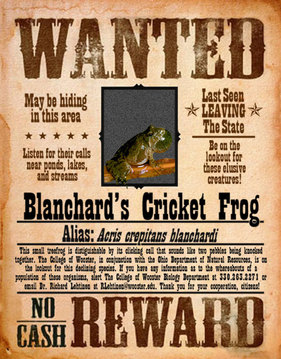
- Name (latin name and common name)
- Picture
- Identifying Characteristics - Key features to look for when identifying this species
- Habitat - Where does this animal live? Include a map. Give its previous range and its current range
- Threats - Why is this species almost extinct? Explain the nature of the "criminals" that have affected this species
- Why it's special - Include adaptations of the species and its specific role in the ecosystem. What other organisms will be affected bythe extinction of your species? What does it eat, how does it fit into the food web of the ecosystem?
- Propose ways that the animal can be helped, include any laws or projects that are already in existence to help the animal. Include a reward (think ecologically, economically, socially, politically, be specific for your species) and why your species should be helped.
- Color, neatness, and creativity!
- All information must be your own words.
- Rubric must be returned with your assignment.
Be prepared to do a short presentation for the class on the species you chose. In your presentation, include what is being done to prevent your species from becoming extinct.
|
The following rubric shows how you will be graded.
|
|
Category |
4 |
3 |
2 |
1 |
Coverage of the Topic |
Details on the poster capture the important information about the topic and increase the audience’s understanding. |
Details on the poster include important information but the audience may need more information to understand fully. |
Details on the poster relate to the topic but are too general or incomplete. The audience needs more information to understand. |
Details on the poster have little or nothing to do with main topic. |
Use of Graphics |
All graphics are related to the topic and make it easier to understand. |
All graphics are related to the topic and most make it easier to understand. |
All graphics relate to the topic. |
Graphics do not relate to the topic. |
Organization |
Information is very organized with clear titles and subheadings. |
Information is organized with titles and subheadings. |
Information is organized, but titles and subheadings are missing or do not help the reader understand. |
The information appears to be disorganized. |
Layout and Design |
All information on the poster is in focus and can be easily viewed and identified from 6 ft. away. |
Most of the information on the poster is in focus and the content easily viewed and identified from 6 ft. away. |
Most of the information on the poster is in focus and the content is easily viewed and identified from 4 ft. away. |
Much of the information on the poster is unclear or too small. |
Mechanics |
No grammatical, spelling or punctuation errors. |
Almost no grammatical, spelling or punctuation errors |
A few grammatical, spelling, or punctuation errors. |
Many grammatical, spelling, or punctuation errors. |
Presentation |
The presentation was the appropriate length. It did not seem hurried or too slow. The presenter spoke clearly and distinctly and established eye contact with the audience. |
The presentation was the appropriate length but seemed slightly hurried or too slow. The presenter spoke clearly most of the time and established eye contact with the audience. |
The presentation was the appropriate length but seemed very hurried or too slow. The presenter spoke clearly and distinctly only some of the time and/or established little eye contact with the audience. |
The presentation was too long or too short. The presenter did not speak clearly most of the time and established little eye contact with the audience. |
